The Lounge: Highlighting channels with unsent messages
Table of Contents
The Lounge is an IRC web client we use at work.
To help you keep track of unsent messages, when you move to a different channel without sending the current message to the current channel, The Lounge adorns the channel with a pencil icon ( ).
).
[We use The Lounge at work, and having taken screenshots from there, I’ve blurred some of the text in the images that follow. The green arrows locate the point I’m making with each image.]
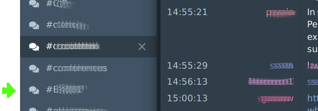
Channels normally look like this:
Channels with an unsent message have a pencil icon:
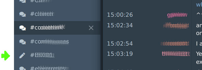
I like this feature, but don’t find the visual signal to be strong enough.
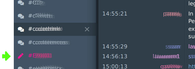
Follow the three steps below to have The Lounge look like this:
CSS to the rescue.⌗
- Click on the Settings icon (the cog at the bottom of the channels sidebar on the left side of the page):
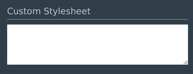
- scroll down to the “Custom Stylesheet” box:
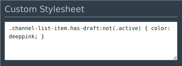
- Copy and Paste the following line:
.channel-list-item.has-draft:not(.active) { color: deeppink; }
And you’re done! Now click back on a channel.
All channels with an unsent message, except for the current channel, will now be displayed in a deep pink colour in the channels sidebar.
Highlight the current channel too?⌗
If you want to also highlight the current channel when it has an unsent message, use the following line instead:
.channel-list-item.has-draft { color: deeppink; }
It’s the same as above, but missing the :not(.active).
Note, you don’t get the pencil on the current channel, just the colouration.
Everyone’s a critic⌗
Speaking of colours, if you’d prefer a different colour, replace deeppink with any valid CSS colour.
Highlight channels with unread messages⌗
Channels with unread messages are given a badge with the number of unread messages. Again, I’d prefer even more obvious visual signalling.
Add the following to the Custom Stylesheet box:
.channel-list-item span:nth-last-of-type(3) { color: lime; }.
and you’ll get something like:
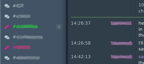
In this example there’s an unsent message in the channel with the unread messages.
[Note: the span:nth-last-of-type(3) is fragile if The Lounge’s html changes, so any improvements are welcome (@hmmn).]
How about highlighting the new mentions icon?⌗
I’ve had a brief look in to doing the same sort of thing for the mentions icon (the ‘@’ symbol in the top right corner of the page, new in version 4.2.0), but couldn’t see how to facilitate this. Suggestions welcome (@hmmn).
More tweaks⌗
There are several tweaks of interest at the “official” tweaks registry.
Bonus: Use Comic Mono for The Lounge⌗
Add the following to the Custom Stylesheet box:
@font-face {
  font-family: Comic Mono;
  font-weight: normal;
  src: url(https://cdn.jsdelivr.net/npm/comic-mono@0.0.1/ComicMono.ttf);
}

@font-face {
  font-family: Comic Mono;
  font-weight: bold;
  src: url(https://cdn.jsdelivr.net/npm/comic-mono@0.0.1/ComicMono-Bold.ttf);
}

body {
  font-family: Comic Mono;
}